A Quick Immersive Limit Redesign
Immersive Limit has a new look
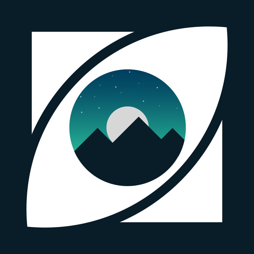
I've felt for a while now that I should freshen up a bit. My old logo and color scheme felt dark and busy and I wanted something lighter, simpler, and more colorful. As you can see in the image above, I kept the mountain concept from my old logo because mountains are a great visual metaphor for testing humanity's limits. I ditched the eye. It just felt too lifeless.
New look - brighter, lighter, and simple.
Old look - dull colors, darker, busy.
The new logo is actually designed in Blender, rather than image editing software. Why?
- Blender is free forever
- I have complete control over the positioning of vertices and scaling
- I can render at whatever resolution I want without resampling
- I could easily compose this into a 3D scene if I ever wanted to (with PBR materials)
I've updated everywhere that I can think of with the new branding and I've also chosen a new template for the website. If you see something that's off or stale, whether it be a logo, color, or font somewhere that just doesn't match, please let me know. Thanks, as always, for reading and let me know what you think of the new design!


